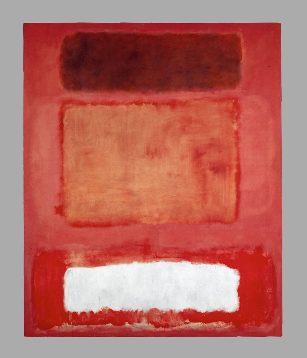
How Mark Rothko Unlocked the Emotional Power of Color

by Alina Cohen | artsy | Jun 25, 2019 »
The name Mark Rothko is synonymous with sensitive canvases that feature arrangements of rectangular panes in vivid hues. The artist was a skilled colorist. The great joy of experiencing his paintings is looking at how the colors, shapes, and backgrounds interact with one another, particularly around the edges. The soft, brushy borders that surround hiscolor fields
create one mood, while the sharper, straighter lines of the central forms elicit another. Alternate juxtapositions of similar or divergent tones—shades of deep blue against dark purple or bright red against brown—elicit disparate emotional responses. In employing a signature structure, Rothko found infinite variation.
 Despite his devotion to this modern, abstract mode, Rothko derived significant inspiration from ancient medieval and renaissance
art and architecture. An erudite researcher, the artist transformed his scholarly understanding of art history into pared-down paintings. If they can at first feel opaque to the viewer searching for reference points, Rothko didn’t mind. “My pictures are indeed façades (as they have been called),” he once said…
